February // 2026
Before working together, West Clay was already a thriving candle and fragrance brand. It had earned national press features, secured major retail placement, and built a loyal customer base — but its visual presence lacked formal brand structure. Aside from a signature peachy-pink hue and primary logo, there was no cohesive system guiding packaging, social content, or tone of voice.
Owners, Suzy and Mo, weren’t looking to reinvent West Clay. They wanted to refine what was already working.
The rebrand focused on developing a clarified color palette, refined typography system, secondary logo suite, and supporting brand accents that could carry consistently across packaging, retail, and digital. We also established visual direction and tonal guidance to bring cohesion to a social presence that previously felt visually scattered.
The result is a more confident, polished version of West Clay — still flirty and colorful, but now unmistakably intentional.
Following the refresh, our partnership has continued to expand. I now lead ongoing packaging design, print collateral, and campaign materials — ensuring that as the product line grows, every touchpoint remains aligned with the refined brand direction.

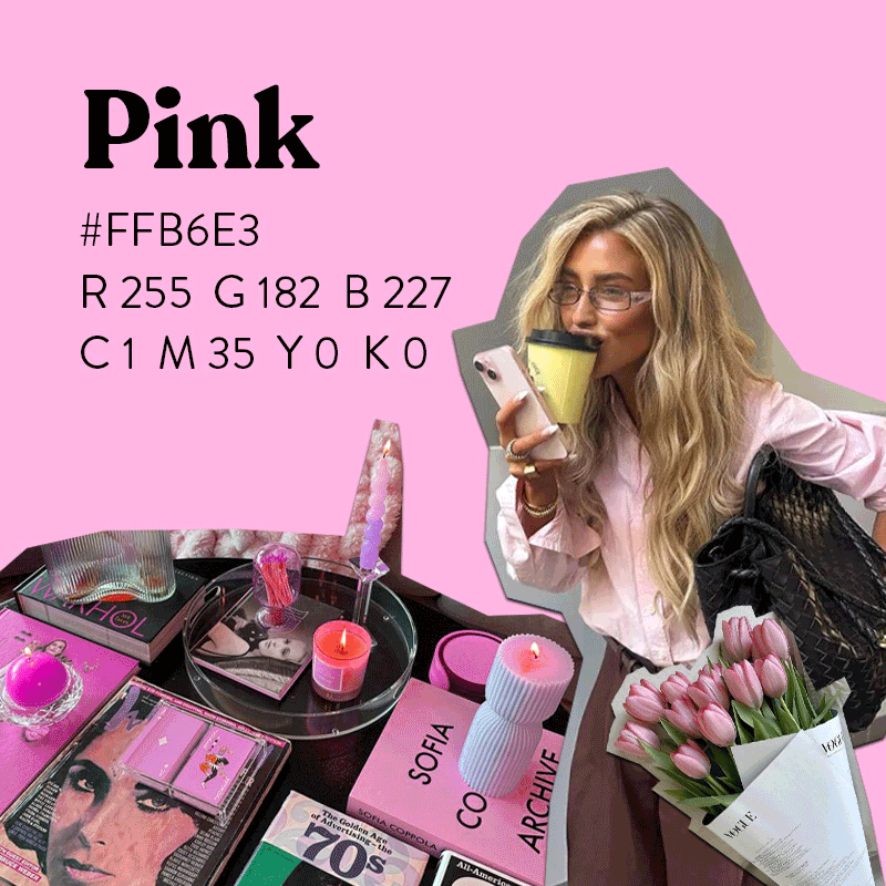
Moodboard for creative direction purposes only. All imagery used for inspiration and belongs to respective copyright holders.
LOGO DEVELOPMENT
With an already recognizable primary logo in place, the focus shifted from redesign to expansion. I built out a flexible logo suite — including secondary marks, submarks, and graphic accents — creating a scalable system that supports packaging, retail, and digital applications with consistency and intent.

SECONDARY


SUBMARKS


BRAND ACCENTS


01 Pretty, But Powerful
Soft, feminine visuals balanced with confidence and intention. Beautiful, but never childish.
02 Clean Meets Cool
Modern, editorial, and design-forward. Clean without leaning wellness-first or apothecary.
03 Iconic & Recognizable
A brand that’s identifiable within seconds, built through strong systems rather than one-off moments.
04 Joyful Indulgence
Products that feel like little treats — designed to delight, gift, and obsess over.